This is the fourth and final instalment of The Internet is for Everyone eBook series. Read the rest of our blogs here.

There is a misconception that accessible websites are plain and that there is a need to sacrifice visual aesthetics for functionality. However, we do not have to choose between style or substance and in many cases, designers do not have to compromise their creative vision to build a user-friendly website.
There are many websites out there that are both beautifully designed and accessible. Here are my top picks.
1. Mailchimp
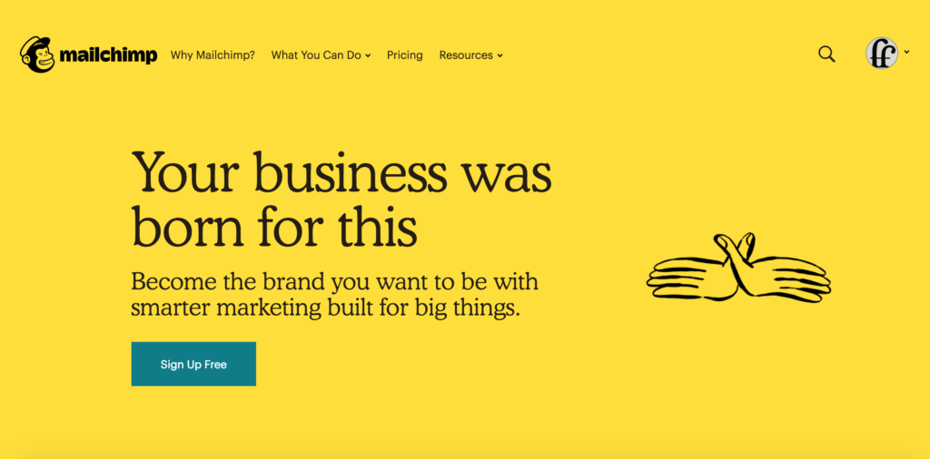
Mailchimp recently upgraded their website and there is so much to love about their new website design. Visually, the website presents information clearly with bold text and clear heading structure. The colours used are also high in contrast and pass the accessibility contrast level requirements.
Upon closer inspection, their website is accessible to vision impaired users and they have incorporated a zoom function of up to 500% of the original desktop view. Mailchimp has a great WAVE report, with minimal colour contrast or structural errors.
2. Apple
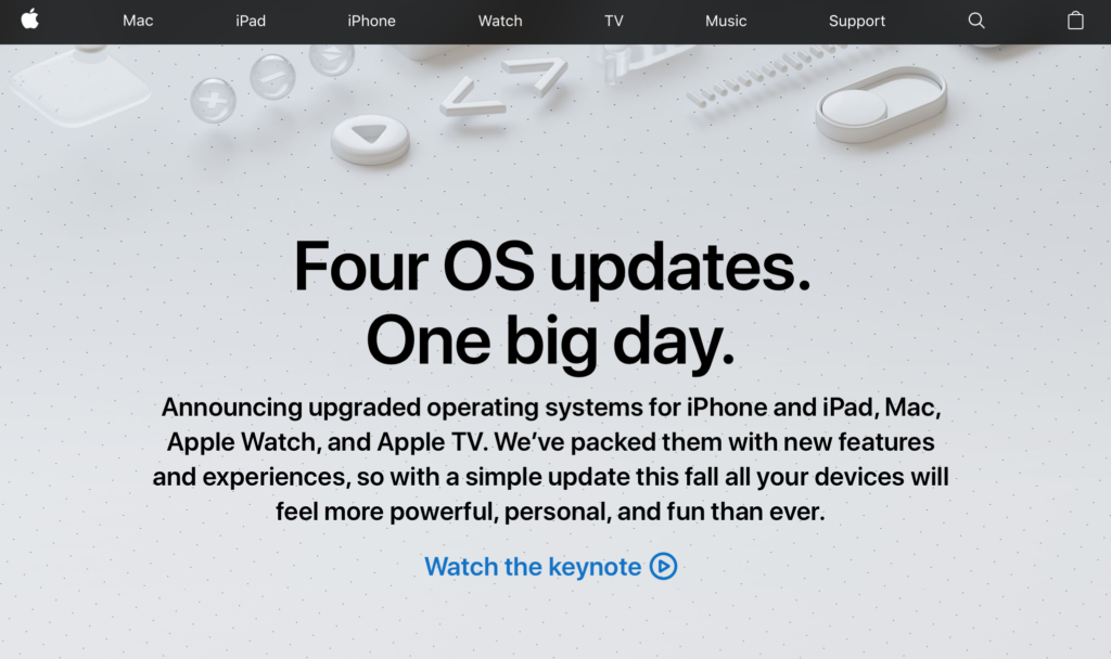
Apple has always been committed to making their services accessible to everyone. As the Apple website is accessed by a diverse audience, it has many functionalities to accommodate their users such as VoiceOver, zoom functions and heading structures with easy keyboard navigation.
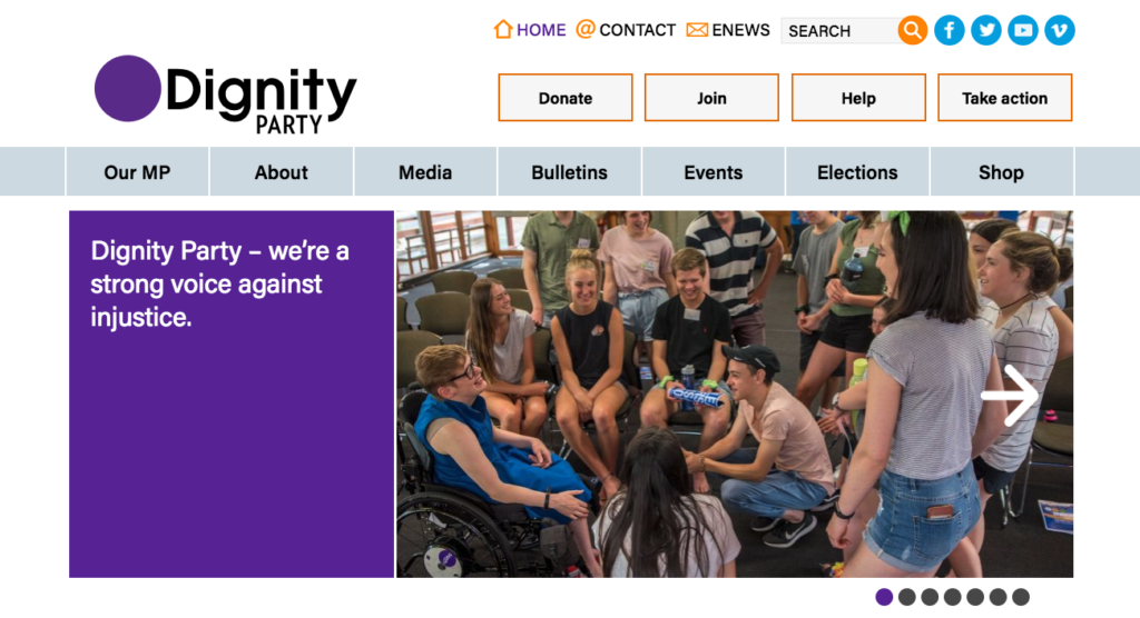
This year Freerange Future supported the Dignity Party and their MLC Kelly Vincent for several years in the lead up to the 2018 South Australian election. We helped them rebrand from Dignity for Disability to Dignity Party, as their focus expanded to equality and inclusion for all.
To surpass the website accessibility guidelines, we made sure the website content was easily viewed and accessible by having alt text, ample clicking space and a high contrast colour scheme. The Dignity Party website has an impressive colour contrast report and passed the WAVE report with flying colours.
4. PyeongChang 2018 Olympic Games
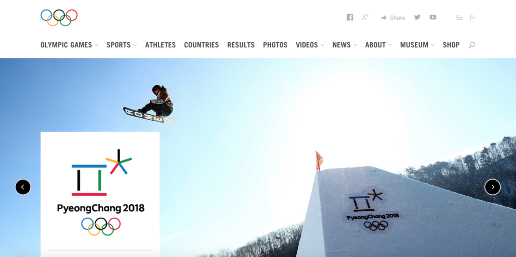
There is no doubt that the Olympic Games Committee have paid attention to the feedback provided by website users. Decades ago, the Sydney Olympics Website was deemed inaccessible by the Web Accessibility Initiative. Fast forward 18 years and their websites are steadily improving, offering inclusive experiences to the broader Olympic Games fan base.
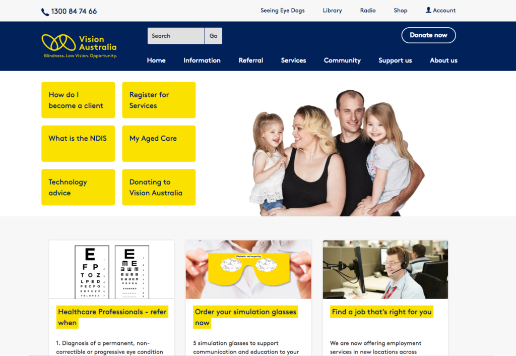
Vision Australia is a leading national provider of blindness and low vision services in Australia. Their website has proven to be highly accessible, having an effective and easy-to-navigate content structure and clear headings.
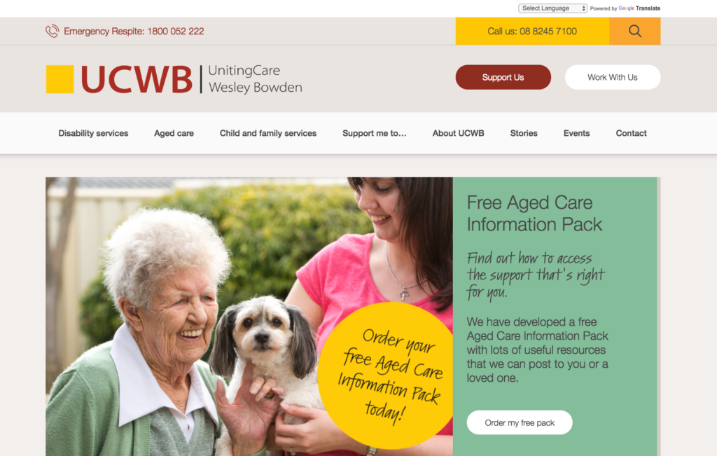
Last year Freerange Future worked with the UCWB team to create a website that conveyed their commitment to providing customer-focused care to people in the disability and ageing sectors.
We implemented several accessibility-focused features including an easy to navigate heading and content structure, keyboard accessible functions, alternative text and bold, large text to help a variety of users access the site’s content.
As one of the leading creative agencies dedicated to supporting positive change and enriching culture, Freerange Future is committed to ensuring our websites are available to as many people as possible, including people with assistive technology and accessible tools.
If this all sounds new to you, please get in touch. We will assist you on your journey to building a beautiful and accessible website, and contribute to an internet that is designed for everyone.
Topics: Accessibility, Digital
