
For many organisations, the annual report has always been a printed or PDF-style document – something you read front to back, page by page. That format isn’t disappearing anytime soon, but more and more organisations are now embracing online annual reports as a way to share their year and showcase their impact – either as a standalone experience or to complement their traditional report.
And it’s not hard to see why.
Why More Organisations Are Choosing Online Annual Reports
Digital and interactive annual reports offer benefits over traditional PDFs:
- Mobile-friendly – no more pinching and zooming on small screens
- Easy to navigate – readers can jump straight to what matters most to them
- Updatable – no need to worry about that one grammatical error that could slip through to print, as online reports can always be updated
- Reusable – while digital reports are an upfront investment, they can be refreshed with new content year after year
- Connected – direct readers straight to your contact page, job listing, or donation form
- Trackable – with analytics, you can see how many people view your annual report and watch your videos
- Low impact – reduces paper use, and eliminates printing cost
- Engaging – interactive, video-rich, and accessible, offering a more engaging experience than static PDFs
Traditional Annual Report Advantages
Of course, there are advantages to traditional PDFs too:
- Browseable – ideal for waiting rooms and reception areas where people can pick up and read a copy
- Tangible – creates a physical keepsake that be filed, stored and revisited many years later
- Traditional – easy to distribute in contexts where print in expected, such as board packs, conference materials or mail-outs
- Accessible offline – can be read without internet access, useful for remote locations or travel
At Freerange, we still create many traditional PDF reports. But increasingly, we’re working with clients to design online annual reports that inform, engage, and inspire – bringing their stories to life through digital design and storytelling.
Here are a few examples of online annual reports we’ve been working on:
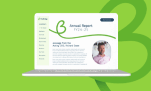
The Bridge Inc
The Bridge wanted an interactive online annual report that gave readers choice – less like a document to read from start to finish. We designed a report with a side menu, animated elements, and video content to create an engaging and accessible experience for their readers.
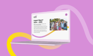
Livit
After the success of their 2024 online impact report, Community Living Australia (now Livit) asked us to evolve the format for their latest digital annual report. We refreshed the design to reflect their new brand and prioritised accessibility and reader engagement throughout.
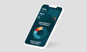
Kudos
For Kudos Services, we created a digital annual report showcasing highlights, key statistics, and stories in an easy-to-explore format. The design was intentionally darker than their core brand palette, giving the report a distinct presence while still aligning with their visual identity.
Looking Ahead: The Future of Annual Reports
Whether you’re after a traditional printed report, or an online annual report, it’s all about capturing the spirit of your year in a way that’s accessible, engaging, and easy to navigate.
At Freerange Future, we combine thoughtful design and storytelling to help you celebrate your impact. We can help you share your story with heart, clarity, and care in a format that’s right for you!
A cohesive and compelling brand can make or break your company. Many successful companies evolve with the time, tweaking their brand for different reasons and adjusting to an ever-changing market. And yes, your product has to be solid and you have to be good at what you do, but without that initial oooooh you can easily be forgettable. Let’s not kid ourselves, we all eat with our eyes first. After we are visually pleased, we can go on to devour all the other elements, but that first look sets the mood.
So what exactly is your mood? What is your tone? What do you want people to think of your business at first glance? It’s as important as your elevator pitch, it can build trust instantly, it can psychologically seduce a user, it can decide whether someone stays or goes.
Maybe you’re looking at your logo and brand and thinking, well we are completely stuffed. But how do we fix it? There’s two different ways to look at it. You can refresh your identity, or you can completely rebrand. To a designer, these terms have very different meanings, but to anyone else this can be confusing to wrap your head around. So we are going to break it down and put forward some questions to ask yourself about your brand and what direction would work best for you.
Brand refresh
Do you just need a fresh lick of paint? Is your brand too recognisable to completely start again? Was your logo made 10 years ago in microsoft paint? No worries, the brand refresh is all about working with your foundations but giving it a new lease on life.
At Freerange Future, we encourage our clients to get their brand up to scratch before you get too far down the rabbit hole. And a brand refresh is often less scary, a little more affordable, but completely revitalising and worth the attention. We might look at revisiting your logo, neatening up your brand illustrations, addressing some new fonts, reconsidering your colour palette if desired.
Here are some examples of brand refreshes we have carefully implemented for a couple of our innovative clients.
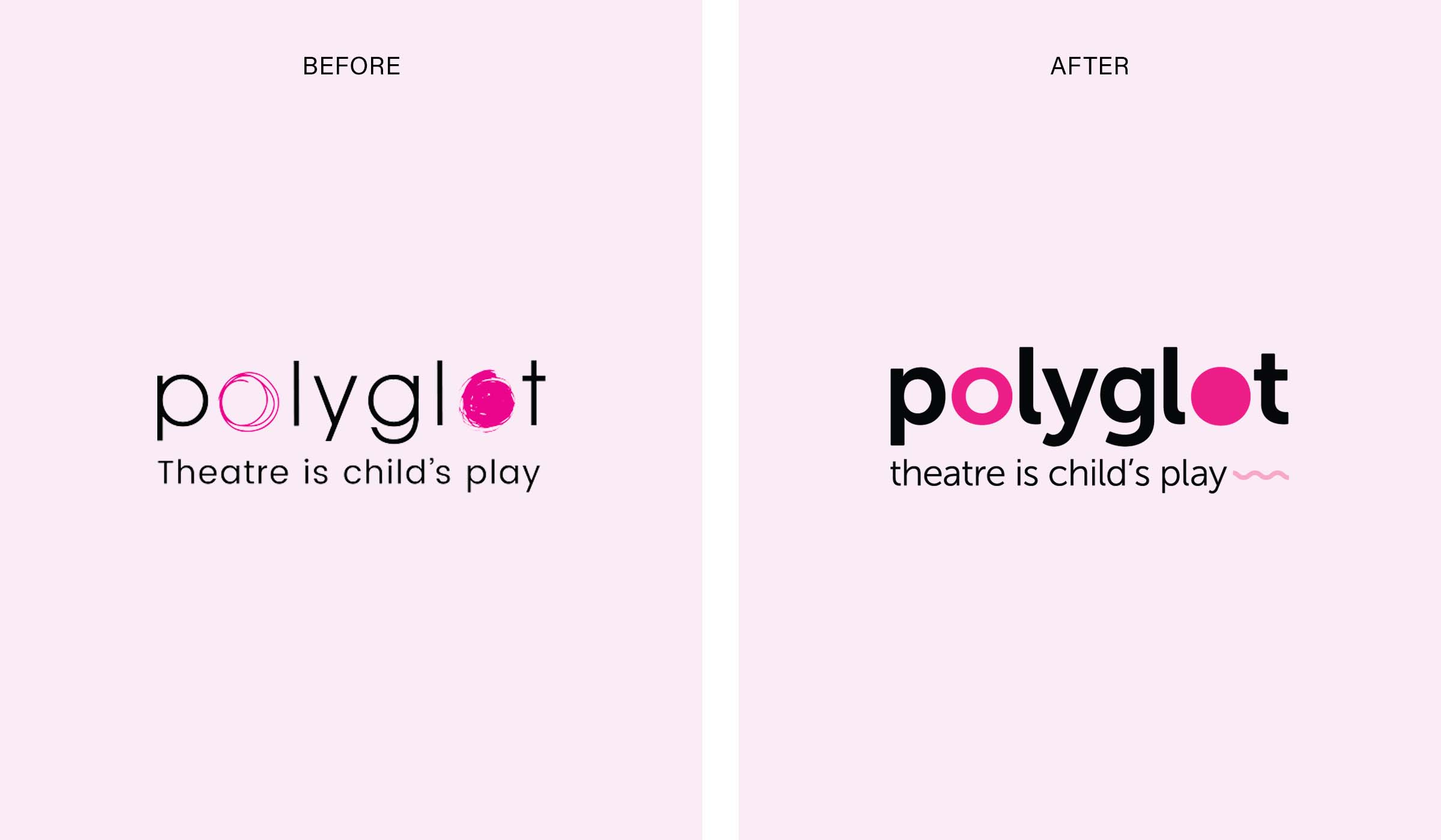
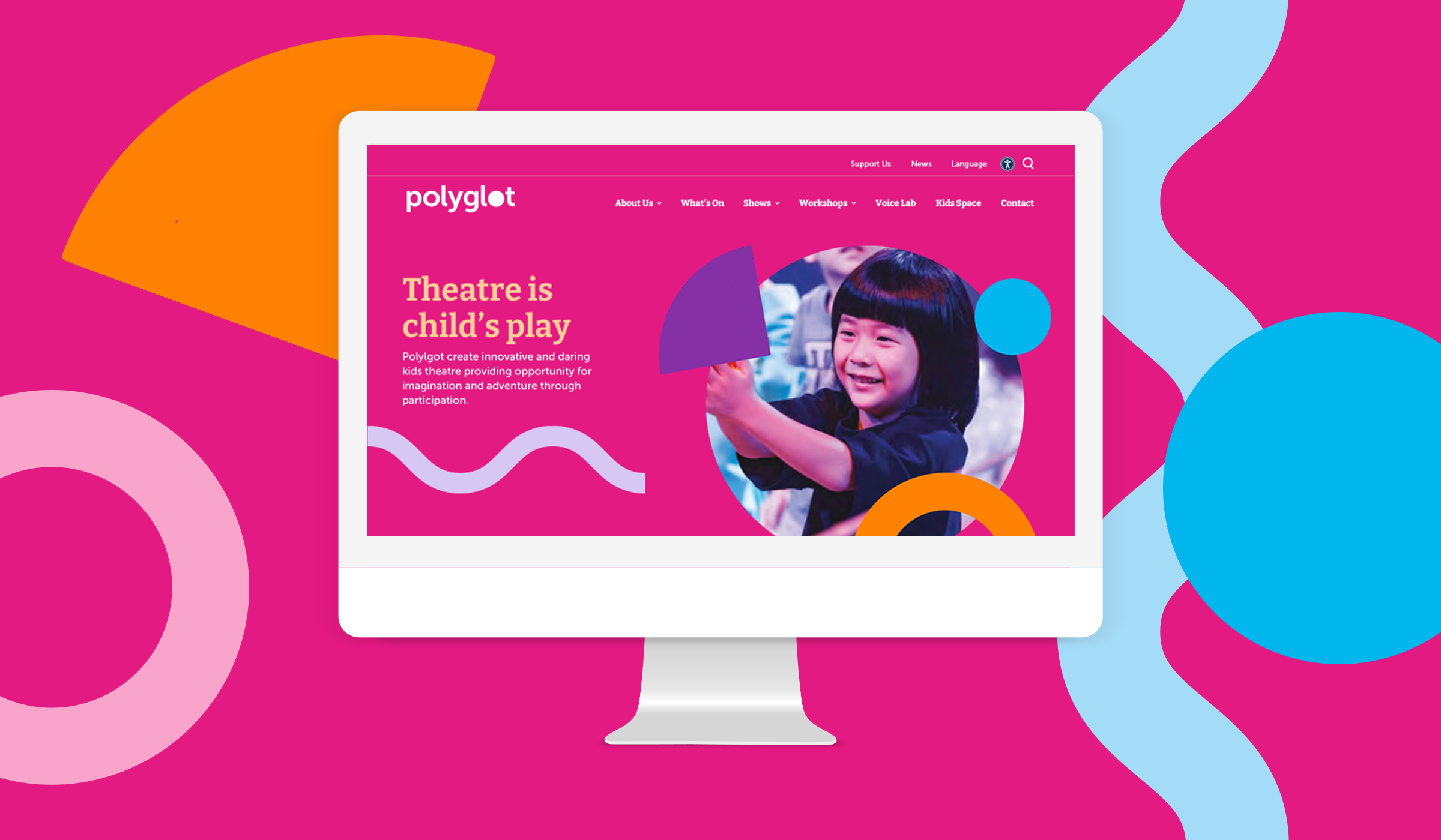
Polyglot
Polyglot engaged us to redesign their website, wanting to bring to life the playful side of their organisation. In early strategy meetings, we discussed the idea of modernising their brand and evolving elements to give a funner personality. We moved the typeface slightly, with more defined characters and a bolder weight to stand out. We gave the circular features within the logo more definition, and crafted a full suite of different shapes from there to expand their lively child-centred identity.
See the Polylgot case study here!
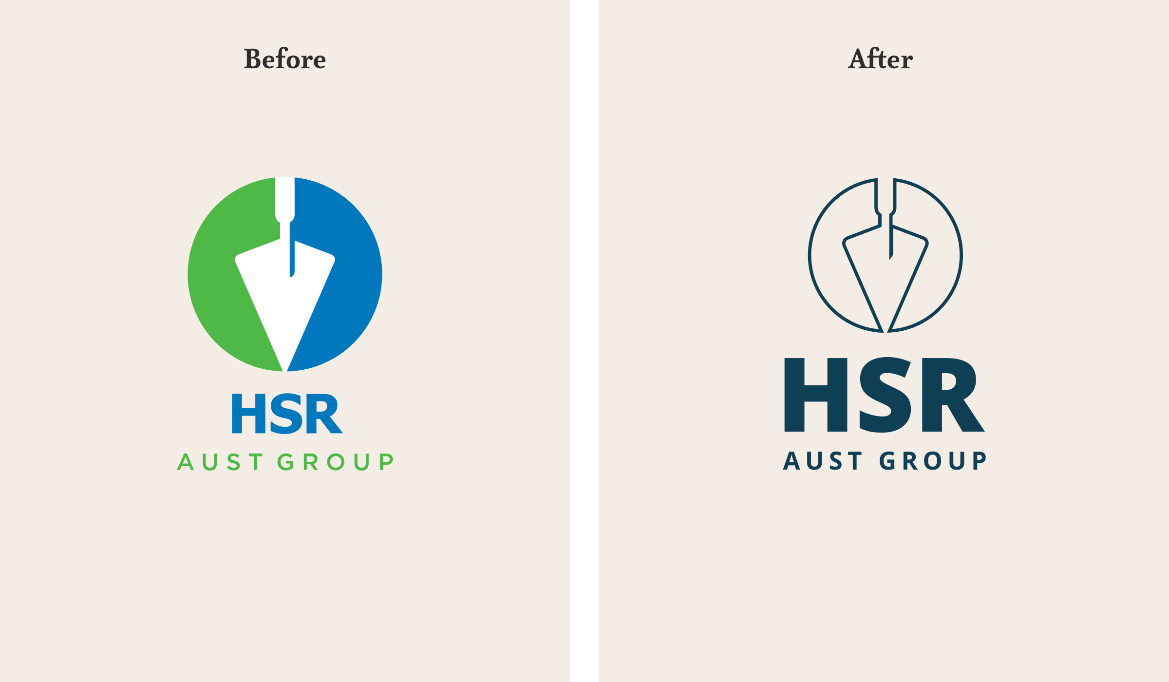
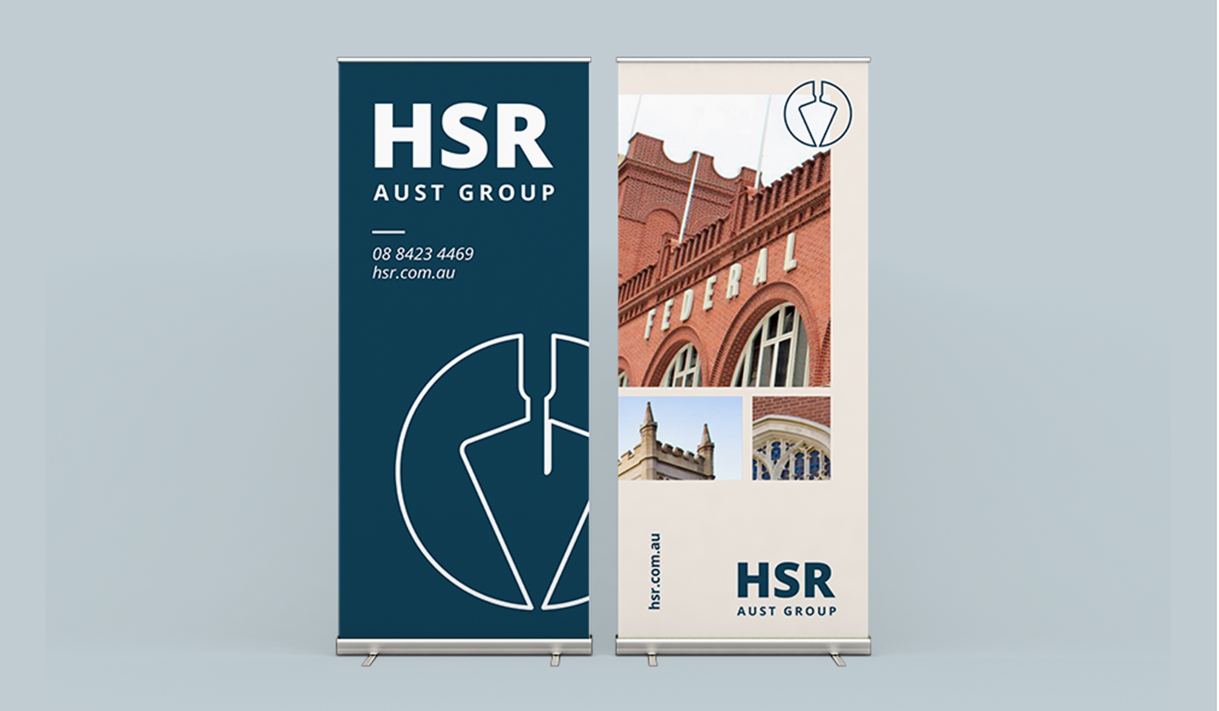
HSR Aust Group
Before redesigning their new website, we encouraged HSR to refresh their brand to follow suit in revitalising their outdated brand. This resulted in a modern colour palette (with an orange used to differentiate their training side of the business) and tweaked brandmark. It’s still recognisable as their brand, but it’s brought them into the 21st century and given their branding the quality it deserves.
Brand redesign
This is the full package. A redesign is when your business needs a complete reboot of its logo and visual identity. It often requires a new marketing strategy and breakdown of what your brand values and messaging are.
Your brand might be too outdated and you want to entirely reset. Maybe you have evolved and outgrown the logo and need to encompass new facets of your organisation. Perhaps your audience has changed, the market has moved, or you’re just generally feeling irrelevant. Whatever the reason, this is the more serious (but exciting) pathway, where all aspects of your company’s foundations will be revisited and explored to create a new and improved identity.
Now this shouldn’t be taken too lightly. It usually requires a bigger budget due to the complete restructure of your brand. So you don’t want it to miss the mark, confuse your users, or not communicate what your company is about. A brand and marketing strategy is the starting point, with collaborative workshops to really dig into your company’s soul and dissect it to find all the right parts to start again.
And again, here are some recent examples of our own rebrand projects done for some amazing clients.
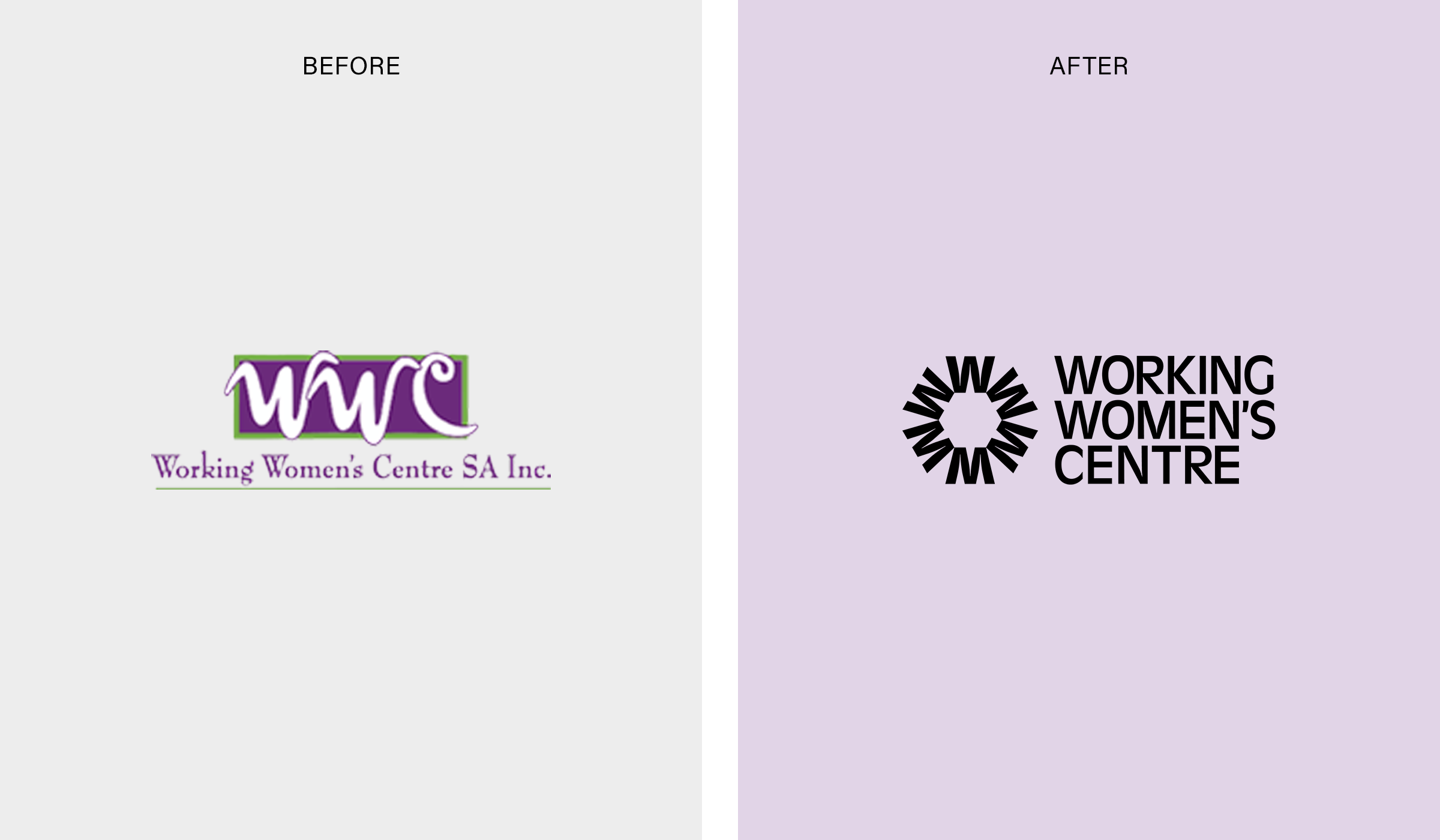
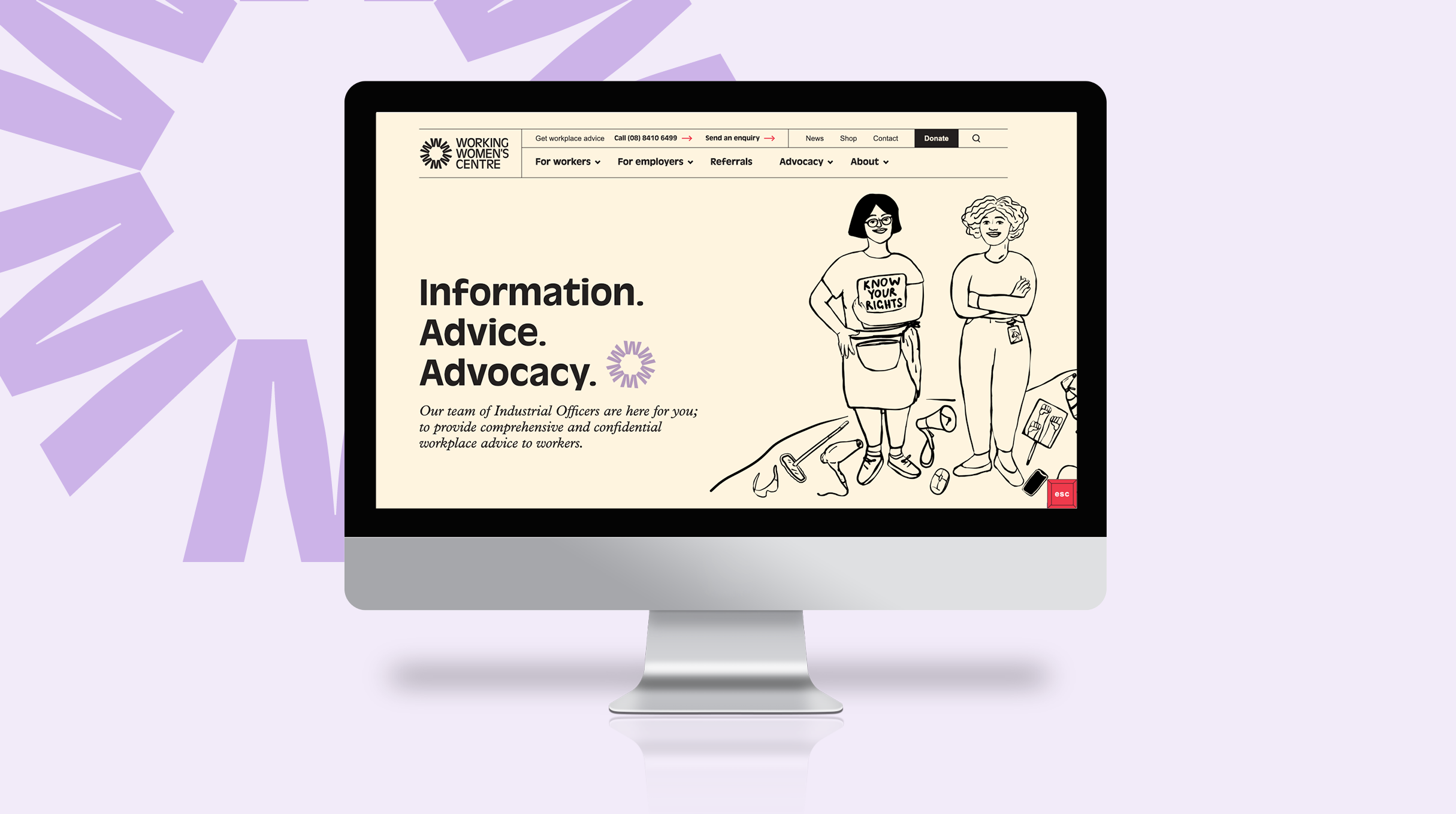
Working Women’s Centre
This client wanted their outdated brand brought into the modern world with a complete brand redesign. Through workshopping we learnt they wanted to reflect their rich history and a passionate personality but still feel professional. The result was a simple brand mark, bold colour palette, and beautiful hand drawn illustrations.
See the Working Womne’s Centre case study here!
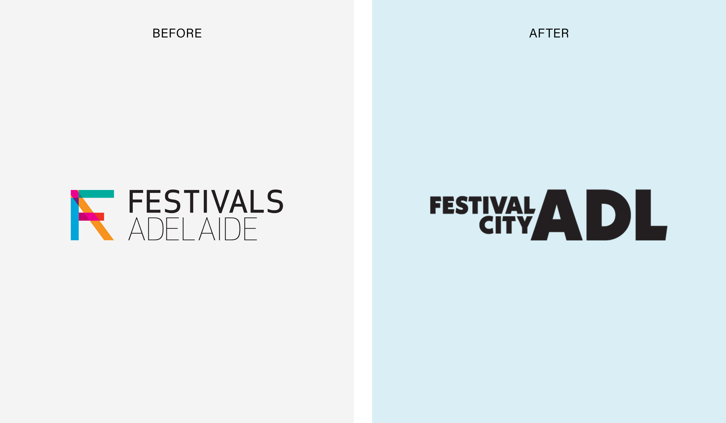
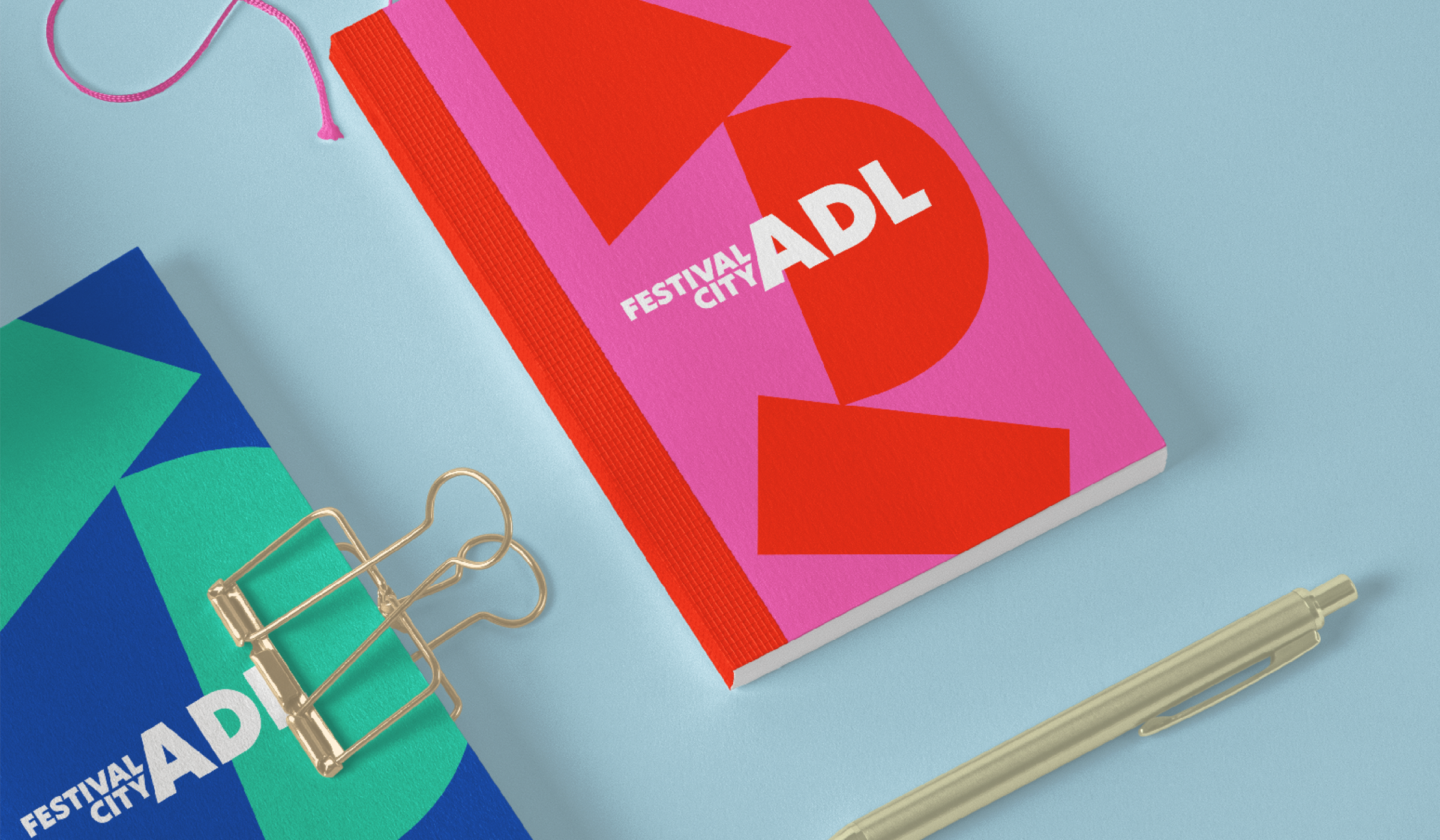
Festival City ADL
Festivals Adelaide is the peak body for festivals in South Australia – the festival state. Working closely with a group of stakeholders from Adelaide’s most prestigious festivals, a new name was found for the organisation – Festival City ADL. The shortening of Adelaide to ADL connected all audiences through the international airport code, ADL. An intelligent and multi-layered brand suite was then developed. With a simple text logo, we used the negative space from within the letters to build a dynamic identity with shapes and colour.
See the Festival City ADL case study here!
So what is the right solution for you?
All brands need evolution. If you look back through the history of some of the biggest brands you will see them tweaked and revitalised throughout the years. So don’t be afraid to take the step, as it can be as big or as little as you want, depending on the reasoning for change. A refresh for a brand that already has solid foundations will preserve your identity and help you stay competitive. Or a rebrand might be better if you’ve outgrown the brand and need a whole new strategy. Think of it like a health check, it’s something you put off but it’s always a relief when it’s done and you’ll be happy you did it. It can be a great opportunity to ask your customers about your brand and involve them in the process too. If you think your brand is ready for a facelift or full reconstruction, get in touch with us to see what options are best suited for you.
So you’ve just been handed over your brand-spanking new website, boasting a highly accessible design that meets AA or even AAA standards and supports all kinds of users. Well done you! You’re helping so many people with disabilities be able to access your information.

But your design agency can only take you so far with accessibility before handing it over to you to add your content. And it’s often when a website gets passed on for client content input, that details can start getting missed that can heavily impact the performance of the site.
Have you added alt tags to all your images? Are your downloadable PDF’s or Word Docs accessible? Do your videos have captions and audio transcripts? Have you selected the right text colour over the right background colours for appropriate colour contrast? There’s a lot to think about if you want to maintain that accessibility rating.
Luckily, we’ve decided to share a little cheat sheet to guide you through what you should be thinking about for different types of content you are adding.
Perhaps you’ve already heard WCAG standards been talked about in relation to your website? For us here at Freerange, we hold accessibility in high regard and follow the globally shared standard for web content accessibility very closely.
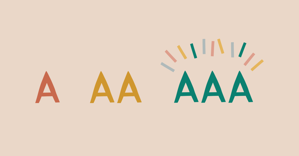
The Web Content Accessibility Guidelines (WCAG) is an internationally recognised standard created by the World Wide Web Consortium (W3C). W3C is the governing body for web standards. The Web Content Accessibility Guidelines (WCAG) have three levels, which categorise the extent of accessibility on a given website or page. The guidelines range in complexity and are named from A to AAA.
These wonderful guidelines are created by the best of the best in the accessibility community and stipulate what to look for when crafting a website or any other digital product. They take the guesswork out of accessibility and give you an in depth list of things to check off.
WCAG version history
So how did it all begin? WCAG 1.0 was the first version of the guidelines and was first released in 1999. Nine years later, the guidelines were reviewed and redefined as WCAG 2.0 in 2008, which remains to this day the definitive world standard. But what about this WCAG 2.1 that I’ve heard about more recently you say? Well it wasn’t so much a full revision, rather an update to add a few additional details surrounding web content on mobile devices.
Who needs to use these guidelines?
No matter what position you hold, whether you are a content manager, designer, or developer, if you are involved with the development of a website you should be considering these guidelines in every step of the process. But don’t worry, it’s not as complicated as it may seem. There are many tools and tips to help you review your accessibility decisions.
Want to learn more? Download our e-book, ‘The Internet is for Everyone’ for the full guide on why and how to make your website accessible.
Subscribe to our newsletter Freeform to stay up to date with our latest blog posts, case studies, and much more.
The complexities of accessibility can be daunting. But think about how daunting it could be for someone with a disability who is trying to find information on your website. There are many different components to understand and consider when creating a design that allows users with a disability to access your information with ease. Let’s break down accessibility and the standards to aspire to.

What is accessibility?
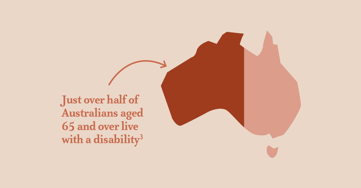
To be accessible is to be able to be reached, understood, and used. 1 in 5 Australians live with a disability and each individual accesses the web with their own methods, tools and preferences.
Why does your site need to be accessible?
Any Australian organisation that offers goods or services on their website is subject to the Disability Discrimination Act of 1992. This act requires that people with disabilities have the same functional access as any other person within our communities.
What are the benefits of an accessible website?
With 15% of the world’s population living with some form of disability, it makes up the largest minority group. By making your website accessible, you can reach into untapped markets and create active participation opportunities for all individuals, making it more profitable and inclusive. By incorporating accessible design during the early stages of branding and website development, you can dramatically save costs on re-branding and designing, which we always strive for with our clients. This is why you should always ensure you are working alongside an agency which has a sound understanding of accessibility standards and needs.
There is a strong business case for accessibility. Fundamentally, accessibility is good business. Accessible websites can have better search results, increase audience reach and proven corporate social responsibility (CSR).
There is no debate that accessibility is an important element of a brand and website. Ask yourself as an organisation and as an individual, do you think accessibility is a part of your brand values? If yes, let’s ensure it is reflected throughout your brand and website. Get in contact with our accessibility team today at [email protected] to discuss how we can instill accessibility standards within your website.
Introduction to Web Accessibility 2018, //www.w3.org/WAI/fundamentals/accessibility-intro/#important

© Freerange Future 2026