


The Brand
Working closely with Yumba Bimbi, Freerange set out to refresh their brand identity while retaining key elements of their recognisable logo. The iconic YB initials and circular shapes were reimagined with a modern twist, incorporating new shades of green to create a visual identity that felt fresh yet familiar. Alongside this, we developed a comprehensive style guide and new business collateral, ensuring their brand was ready for the future.


The Website
The heart of Yumba Bimbi’s brand refresh was a new website built with accessibility as a fundamental priority. We focused on creating a platform that would be easy to navigate for everyone, following WCAG 2.1 AA standards. The site’s design balances clarity and visual appeal, with high-contrast elements and readable fonts making it simple for users to interact with. To enhance accessibility further, we incorporated the Userway accessibility widget, which provides visitors with options to adjust font sizes, colours, and contrast settings, tailoring the experience to their individual needs.


Working with Freerange Future is an absolute pleasure. The impact of their creative and inclusive designs that carried through to our website has elevated our communication strategies, ensuring greater engagement and connection with our customers and community.
Juliette McCorley
General Manager – Operations
Highlights
Brand refresh
Yumba Bimbi’s brand refresh balances tradition and innovation, ensuring it reflects the values of accessibility, inclusivity, and community spirit.
Website accessibility
The centrepiece of the refresh is a new website built with accessibility at its core, a layout that’s easy to navigate for users of all abilities.
Brand toolkit
To ensure consistency and professionalism, Freerange developed a comprehensive style guide and business collateral alongside the refreshed brand and website.
Accessibility
How accessible is your website and brand?
1 in 5 Australians have some form of disability. We consider accessibility as a high priority, ensuring our websites meet WCAG 2.0 accessbility standards and additional widgets can be utilised. Does your website have contrast errors? Is it keyoboard-friendly? Are your text sizes legible? Do you use image alt-tags? Let us help build an accessible product for you.
Get in touch about accessibility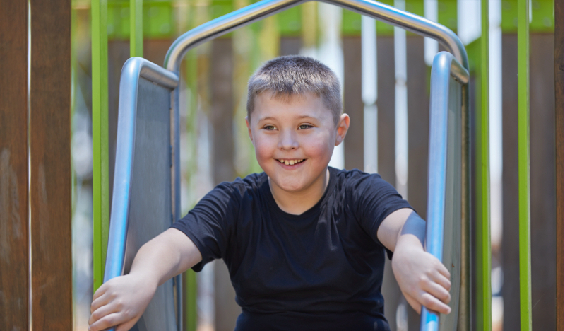


© Freerange Future 2026