What is Google Ad Grants?
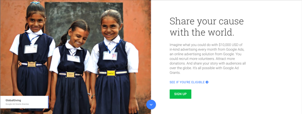
Google Ad Grants is a version of the Google Ads online advertising tool but for nonprofits. It provides a monthly allowance of 10,000 USD for qualifying not-for-profit organisations to reach new audiences and share your message with the world.
Once you’ve received a Google grant, you’ll need to maintain it. Here’s what you need to know:
1. Valid Conversion Tracking
Since January 2018, advertisers in the program are required to implement accurate conversion tracking. This equates to accurately setting up and reporting one conversion a month to show that you are generating meaningful conversations with your target audience.
2. Keyword relevance
To ensure campaigns are mission-related, it is important for keywords to be specific and relevant. Use the search terms report to understand the language your audience uses and integrate this into your keyword strategy. Ad Grants does not permit generic, single keywords, trademarked and health/medical terms.
3. Ad Grants’ click-through rate (CTR) requirements
Ad Grants using AdWords must have a consistent 5% CTR each month to remain eligible for the program. Failure to do so will incur a temporary account deactivation.
4. Effective ad copy
Draft 3-5 compelling ads for each ad group that relates to the keywords in your ad group. The ads will rotate and prioritise the best performing ad in the group. By creating a number of variations, over time you’ll learn the headlines that work.
It is best to use short sentences that are non-repetitive. Avoid using shorthands and uncommon words but do use words that showcase the unique services your organisation has to offer.
5. Automatically set bids
By automating bids with Google Ads, it saves you plenty of time managing the account. Use a Smart Bidding Strategy to maximise conversions. This will automatically set bids which will help you get the most conversions for your campaign while on a budget. Maximise conversions bidding strategy will help you identify keywords that produce desired actions, resulting in more bids on them and less on others.
You can go to the Settings tab in your campaigns to switch on Maximise conversions.
Looking to apply for a Google Ads Grant? Contact our Head of Marketing at [email protected] to find out more.
It’s that magical time of the year again!
Each February and March, we look forward to the rich and diverse artistic productions, performances and exhibitions Adelaide has to offer. The impressive program crafted by both homegrown artists and international acts breath life to the remaining days of summer, bringing on robust activity into the Festival State.
With festival mode happening in full effect, here are our top picks for the season.
Alicia – Manus
Directed by Nazanin Sahamizadeh / Verbatim Theatre Group
I’m looking forward to this, and also not looking forward to it because I know it will be hard to watch. I think it’s important that as citizens of Australia (and human beings), we take the time to understand the plight of people our government is holding prisoner in such appalling conditions. Aaaaand bonus entry – a free exhibition at the Art Gallery; Quilty.
//www.adelaidefestival.com.au/events/manus/
Rey – Badass
Presented by Big Hair Productions
Having a weakness for musicals and parodies, I’m most looking forward to another fun performance by Tash York. She has a way of delving into relatable issues in a light-hearted way and having watched Tash’s previous performance Adulting last year, I am truly excited to see what Badass will bring.
//adelaidefringe.com.au/fringetix/tash-york-badass-tas1-af2019
India – FLIGHT
Presented by Realscape Productions in association with DARKFIELD
What’s better than an unsettling experience of mishaps during a flight? This show looks like an experience that isn’t for those with a fear of being in the sky! Me on the other hand, this sounds like 20 minutes of fun!
//adelaidefringe.com.au/fringetix/flight-af2019
Wayne – WOMADelaide
If you love music you have to love WOMAD. The best thing about this amazing festival is that it brings not only some of the best musical talents from around the globe to our beautiful parklands but also their showcases their wonderful culture. The musicianship, colour and spectacle is a rare treat that we’re very fortunate to host in Adelaide. It really is multiculturalism in harmony and a great opportunity to broaden your own cultural experiences… oh and the live music rocks too!
Hannah – Jason Pestell: Kmart is Life
Presented by Kmart Lad
I’m looking forward to Jason Pestell’s Kmart is Life because as a bill-paying adult, let me tell you Kmart is life-saving. You know, when they actually have what you want in stock…and it’s not damaged.
Also a special shout out to all the Food Trucks that will be around the city — I’m looking forward to getting to know you.
//adelaidefringe.com.au/fringetix/jason-pestell-kmart-is-life-af2019
Amy
The Second Woman
Produced by Performing Lines
This is a Vitalstatistix show, and it looks astonishing. 24 hour performance endurance where a woman meets the same man in the same script, except the script stays the same but the man changes. 100 times over.
//www.adelaidefestival.com.au/events/the-second-woman/
Laraaji
Presented by RCC Fringe
Search this in Spotify. If you have a decent sound system, turn it up. Then you’ll know why this is something other than anything ordinary. Can’t wait.
At Freerange, we are passionate about what we do – and how we can positively contribute to our community. One way is through the work experience program which we host yearly to cultivate the next generation of designers and creatives.

Over the past 10 months, five students in years 10 – 12 from Playford College, Christies Beach, Glenunga, Wilderness and Henley Beach have participated in this program. Each student was given the same design brief and were guided by our talented designers, Hannah and India, to learn the fundamentals of branding and design.
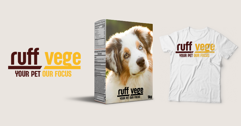
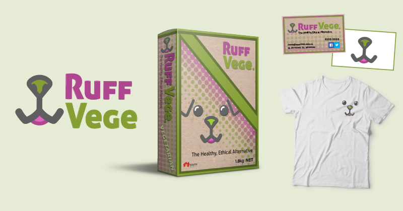
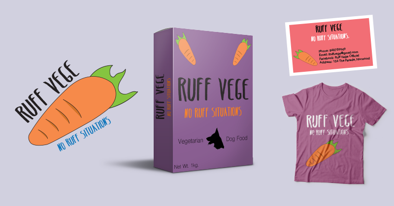
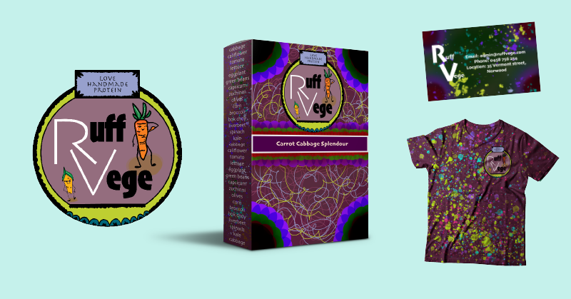
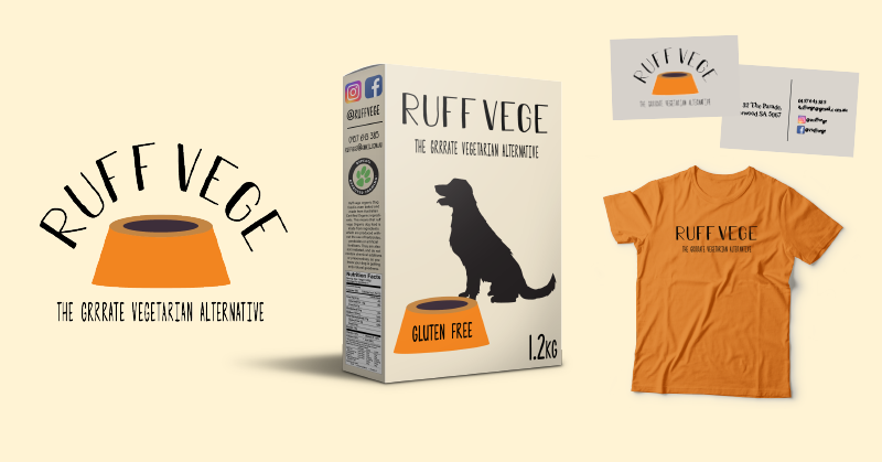
This year, students worked on a brand project called Ruff Vege. With factory farming being one of the leading contributors to animal cruelty, we decided to bring their awareness to ethical food production. Ruff Vege is a made up social enterprise run by the eccentric Sasha (Freeranger Rey), bringing cruelty-free and handmade alternatives to the pet food industry.
At the conclusion of the program, we invited students, their parents and teachers to an end-of-year Work Experience Exhibition to showcase their excellent work and celebrate their accomplishments.
Big thanks to the whole team, especially Hannah and India for their continuous dedication in mentoring and guiding the students and Rey for coordinating the program and roleplaying Sasha.
Over the course of 2018, we have been working hard to create a mobile game – one that is simple, fun and can be enjoyed by everyone. We fundamentally believe that games – just like websites – should be accessible to everyone. This is the story of how we created Mancala Voice and what we learnt along the way.

With the number of gamers steadily increasing each year, new and innovative products are continuously being created to meet player demand. Nonetheless, disabled gamers are still routinely left behind within the gaming community.
Someone who knows this very well is our own Tim Carter, a vision impaired programmer who has been a part of the Freerange Future team for the last 18 months. Initially employed under a Disability Employment Services wage subsidy program facilitated by the Royal Society for the Blind, Tim’s determination, programming skills and enthusiasm for gaming really shone.
Through Tim’s lived experience we recognised the need for more accessible games and saw this as an opportunity. With Tim leading the development, we decided to create an accessible game of our own – a version of the classic board game Mancala, for iPhone and iPad. Mancala Voice has been designed for both vision impaired and sighted players and is fully integrated with Apple’s VoiceOver technology.
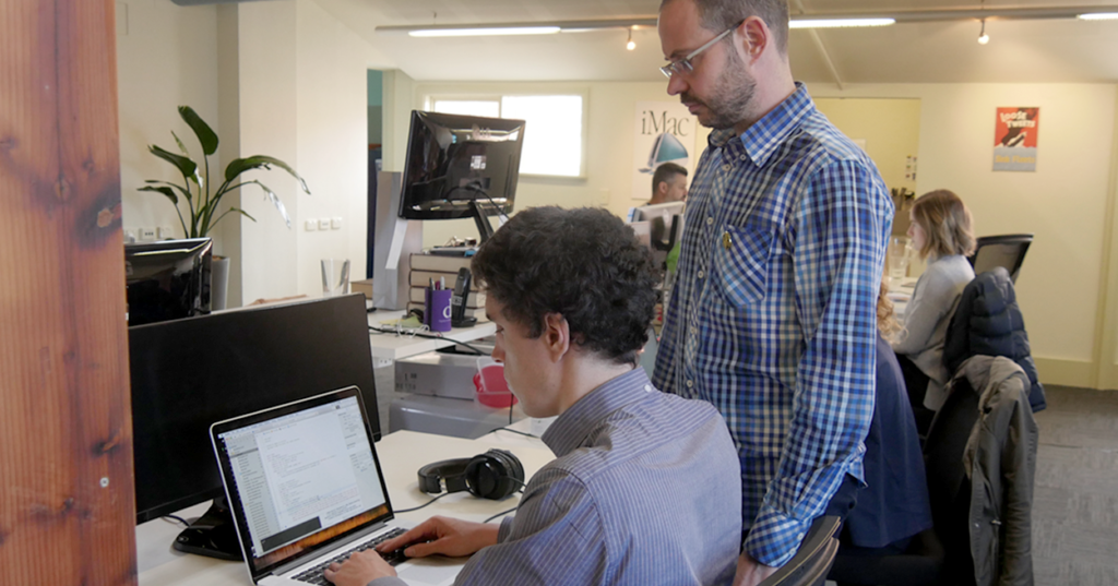
Tim created the game engine based on his use of a physical Mancala game. Through a number of prototypes, we explored various interaction approaches – Apple’s VoiceOver technology that reads and describes screen-based content, touch controls and voice commands so that users can speak instructions to the game. Ultimately we settled on using the first two.
As Tim was developing the game, our UX designer Hannah Blake created a visual interface for sighted users. Working collaboratively, Tim was able to integrate the visual design with his game engine and then the team worked to make this interface flexible for different devices sizes. We’ll be continuing to improve and enrich this game over the next few months and then will look for a new challenge.
Over the course of this project we’ve learnt to think differently about the needs and abilities of disabled gamers. Our key takeaways are:
- Finding that balance of challenge, fun and simplicity
- Lived experience is the ultimate design reference
- VoiceOver can enrich almost any app for the vision impaired
As we launch Mancala Voice, we recognise the importance of bringing inclusion to the table from the start of any digital project. Laying the foundations for an accessible future takes practice and determination, but with the support of the wider community we all have the opportunity to create change.
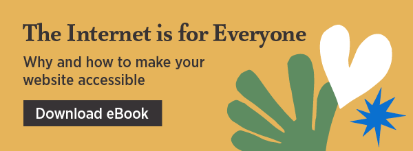
This is the fourth and final instalment of The Internet is for Everyone eBook series. Read the rest of our blogs here.

There is a misconception that accessible websites are plain and that there is a need to sacrifice visual aesthetics for functionality. However, we do not have to choose between style or substance and in many cases, designers do not have to compromise their creative vision to build a user-friendly website.
There are many websites out there that are both beautifully designed and accessible. Here are my top picks.
1. Mailchimp
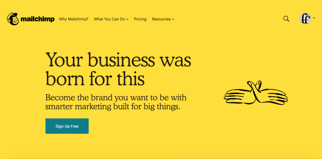
Mailchimp recently upgraded their website and there is so much to love about their new website design. Visually, the website presents information clearly with bold text and clear heading structure. The colours used are also high in contrast and pass the accessibility contrast level requirements.
Upon closer inspection, their website is accessible to vision impaired users and they have incorporated a zoom function of up to 500% of the original desktop view. Mailchimp has a great WAVE report, with minimal colour contrast or structural errors.
2. Apple
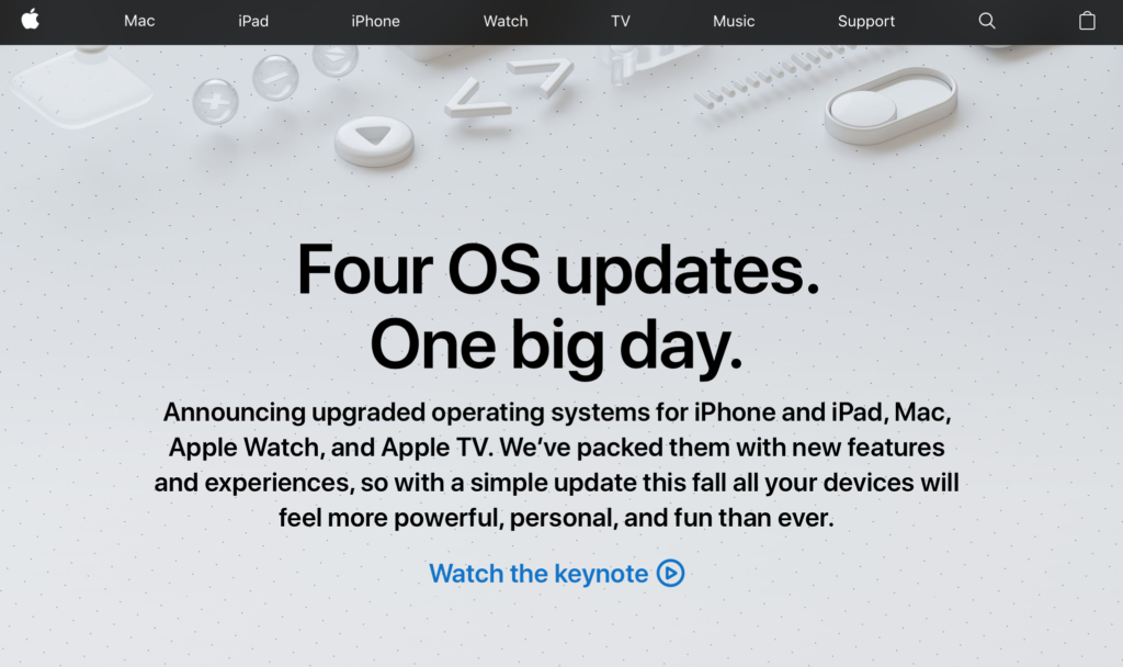
Apple has always been committed to making their services accessible to everyone. As the Apple website is accessed by a diverse audience, it has many functionalities to accommodate their users such as VoiceOver, zoom functions and heading structures with easy keyboard navigation.
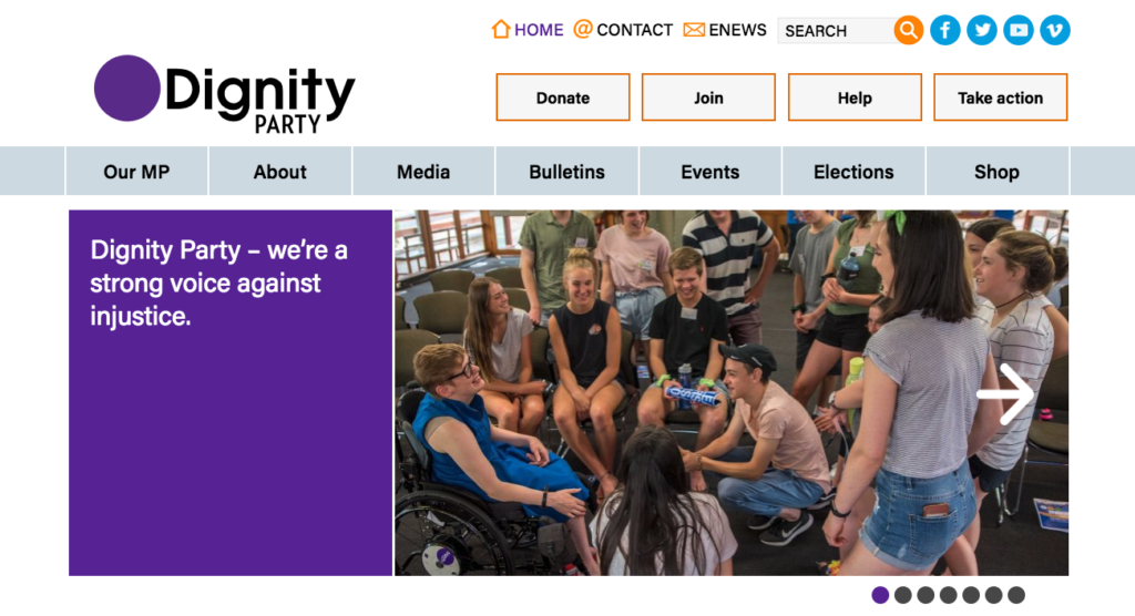
This year Freerange Future supported the Dignity Party and their MLC Kelly Vincent for several years in the lead up to the 2018 South Australian election. We helped them rebrand from Dignity for Disability to Dignity Party, as their focus expanded to equality and inclusion for all.
To surpass the website accessibility guidelines, we made sure the website content was easily viewed and accessible by having alt text, ample clicking space and a high contrast colour scheme. The Dignity Party website has an impressive colour contrast report and passed the WAVE report with flying colours.
4. PyeongChang 2018 Olympic Games
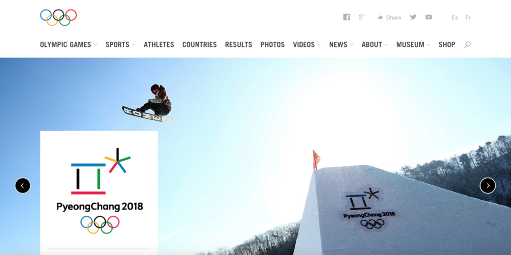
There is no doubt that the Olympic Games Committee have paid attention to the feedback provided by website users. Decades ago, the Sydney Olympics Website was deemed inaccessible by the Web Accessibility Initiative. Fast forward 18 years and their websites are steadily improving, offering inclusive experiences to the broader Olympic Games fan base.
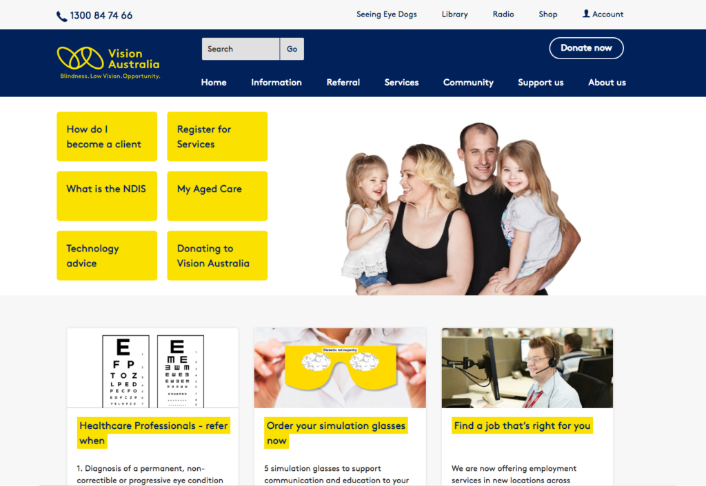
Vision Australia is a leading national provider of blindness and low vision services in Australia. Their website has proven to be highly accessible, having an effective and easy-to-navigate content structure and clear headings.
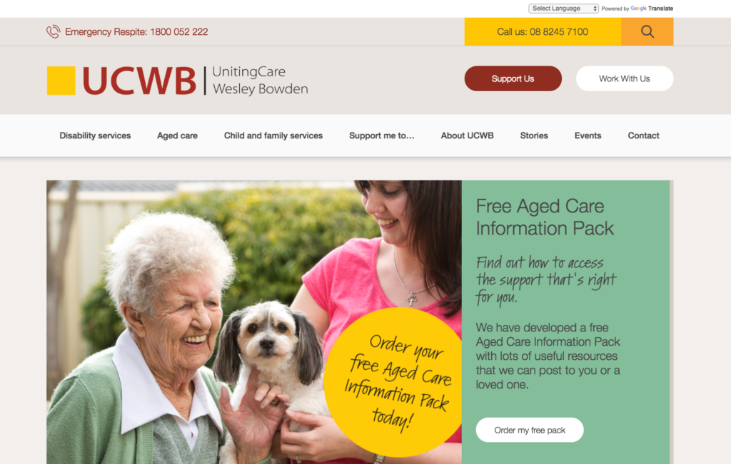
Last year Freerange Future worked with the UCWB team to create a website that conveyed their commitment to providing customer-focused care to people in the disability and ageing sectors.
We implemented several accessibility-focused features including an easy to navigate heading and content structure, keyboard accessible functions, alternative text and bold, large text to help a variety of users access the site’s content.
As one of the leading creative agencies dedicated to supporting positive change and enriching culture, Freerange Future is committed to ensuring our websites are available to as many people as possible, including people with assistive technology and accessible tools.
If this all sounds new to you, please get in touch. We will assist you on your journey to building a beautiful and accessible website, and contribute to an internet that is designed for everyone.

This is part 3 of The Internet is for Everyone blog series. Read our previous blogs on website accessibility here.
In 1997, a group of designers and architects came together to develop the seven principles of universal design. Led by the late Ronald Mace, their intention was to create a guideline for designing environments, products and communications.
But what led Mace to become the Father of Universal Design?
For most of his life, Mace worked as an architect and was an advocate for universal design thinking. As a wheelchair user for most of his life, he had many barriers and understood what it’s like to live in a world that is not designed to be inclusive. Mace then became a passionate voice for accessibility and universal design. Before his death, he had created many opportunities for accessible design which still impact our work today.
Principles of universal design
User experience starts with users. People are the first consideration in any design, and that includes people with disability and impairments. Digital creators who use the seven guiding universal design principles will be better informed in creating inclusive and accommodating web design.
1. Equitable use
1a. Provide the same means of use for all users: identical whenever possible, equivalent when not
1b. Avoid segregating or stigmatising any users
1c. Provisions for privacy, security, and safety should be equally available to all users
1d. Make the design appealing to all users
Web design examples:
- High colour contrast helps users with colour blindness to differentiate content on a screen
- Provide alt text descriptions in images for screen reader users

2. Flexibility in use
2a. Provide choice in methods of use
2b. Accommodate right- or left-handed access and use
2c. Facilitate the user’s accuracy and precision
2d. Provide adaptability to the user’s pace
Web design example:
- A person who is sensitive to light will find it difficult to use a glaring screen without resulting in headaches or sleeping disorders. To address the issue, you can give them the option to turn off the blue light or to install applications
3. Simple, intuitive use
3a. Eliminate unnecessary complexity
3b. Be consistent with user expectations and intuition
3c. Accommodate a wide range of literacy and language skills
3d. Arrange information consistent with its importance
3e. Provide effective prompting and feedback during and after task completion
Web design examples:
- Ensure your content uses the appropriate headings (h1, h2 and h3) and are easy to follow visually
- Write in plain English and avoid using jargon so users can understand the content easily

4. Perceptible information
4a. Use different modes (pictorial, verbal, tactile) for redundant presentation of essential information
4b. Provide adequate contrast between essential information and its surroundings
4c. Maximise “legibility” of essential information
4d. Differentiate elements in ways that can be described (i.e., make it easy to give instructions or directions)
4e. Provide compatibility with a variety of techniques or devices used by people with sensory limitations
Web design example:
- Enable open/closed captions and Auslan interpretation in videos for users with audiovisual impairments

5. Tolerance for error
5a. Arrange elements to minimize hazards and errors: most used elements, most accessible; hazardous elements eliminated, isolated, or shielded
5b. Provide warnings of hazards and errors
5c. Provide fail safe features
5d. Discourage unconscious action in tasks that require vigilance
Web design examples:
- Ensure form error messages are located at the error location. This makes finding and fixing errors much more accessible for all users, especially the cognitively impaired
- Error messages should clearly explain the error and provide clear instructions on fixing the issue

6. Low physical effort
6a. Allow user to maintain a neutral body position.
6b. Use reasonable operating forces.
6c. Minimise repetitive actions.
6d. Minimise sustained physical effort.
Web design example:
- Enable keyboard shortcuts for users with limited mobility.
7. Size and space for approach and use
7a. Provide a clear line of sight to important elements for any seated or standing user.
7b. Make reach to all components comfortable for any seated or standing user.
7c. Accommodate variations in hand and grip size.
7d. Provide adequate space for the use of assistive devices or personal assistance.
Web design example:
- Allow accessible features such as the pinch-to-zoom function to work on mobile
Universal design is meant to be forgiving. As users, we enjoy products that are accessible to all. Download our eBook to learn how you could make accessible-friendly websites.

© Freerange Future 2026