The perfect navigation doesn’t exi… Actually, if you follow these navigation tips, your cause driven website will be well on the way to having the perfect navigation.
This is the fifth in a series of eight posts inspired by our eBook The Complete Cause Driven Website. Links to the other posts will be included at the bottom of the page as they’re published. You can download the book for free and it’s full of many more useful insights in creating a highly effective website for a cause.
Let’s start here: you want people to use your website. People like things to be easy. Therefore you need to make your website navigation easy. Easy to understand. Easy to find things. Easy to know where you are.
1. Don’t cram too much in there
The Goldilocks zone for website navigations is 4 – 7 items. That’s the range that people can comfortably process without being overwhelmed. Less than four and you’re missing an opportunity to promote your content, more than seven and people’s ability to find things quickly drops.
2. Don’t go too deep
Some experts say that any kind of drop down menu in a navigation is bad, primarily because it obscures things from users. At Freerange we’re not militant about this but we do recommend not going any deeper than one level of drop downs in your site navigation. With each level it’s an order of magnitude harder to find things and navigations quickly become difficult for people to operate as they pop out left, right and centre. Deeper navigation can be in a sidebar. If you really need more, consider mega menus.
3. Familiarity breeds contentment
There was a time for experimental and unique interface and navigation designs. That time was a decade ago. Navigation is a design problem that has been solved. Sure you can still be stylish and stand out but people don’t have the cognitive patience to figure out how your unique navigation works. Keep it simple.
4. Nobody remembers who came second
People best remember the first and last things in a list – the so called primacy and recency effects. Hence, the first and last items in your cause website navigation are the most valuable spots. If you just slotted About and Contact Us in there, you’re missing out on directing people to more significant content.
5. Everyone can find their way home
With a maximum of seven items in your navigation, do you have room in there for Home? You don’t need it. Everybody knows that big logo at the top left links to your homepage.
6. What did you call me?
There’s a reason that most sites have pages called About, Contact, Products, Services, etc. They’re language affordances – things that your users understand. In naming your pages it’s important that you capture the meaning of the page as people and search engines need to quickly determine what the pages are about. Be interesting but don’t try too hard, if you call your Shop an Emporium, it’s going to confuse people.
7. Break out of that old way of thinking
It’s a common practice these days to pull out a few key calls to action and put them above your navigation where they really stand out. Whether they are social links, an email sign up or something more significant like a Donate button, these ‘break out’ navigations are effective, as long as they visually stand out but don’t overwhelm the main navigation.
8. A sticky situation
In the old days of the web, people tried to cram everything ‘above the fold’ in a web page so that people didn’t have to scroll down. These days we’re all pretty comfortable scrolling and some pages get really long. For just this reason sticky navs are a thing: now when you scroll down the page a thin navigation sticks to the top the browser window and you can keep browsing the site without needing to scroll all the way back up again. Everybody wins!
9. Supersize it
If you really need to cram a lot into your navigation then the mega menu is a great option. In this design pattern when you roll over an item in the navigation a large pane appears. If you just stick a tonne of links in there it’s going to be overwhelming but with all that space there is room for icons and descriptions to help people navigate or perhaps a call to action relevant to that section of your cause website. Use that space wisely.
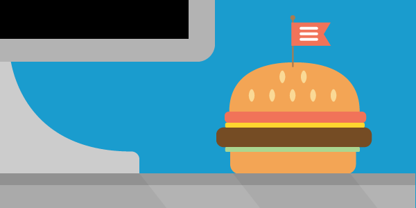
10. No hamburgers at your desk
The Hamburger menu has been a great invention for mobile websites where there is little space available for a navigation. It’s becoming more and more common to see them in tablet and even desktop site designs though and this isn’t great. It sure makes your site look tidier but it hides everything from the user, making it harder for them to find stuff and reducing opportunities for them to stumble across interesting things.
Take a look at your website. How many of these tips are reflected in your navigation? There are some things here that are easy to action and can make a big difference. Give them a try.
The Complete Cause Driven Website blog series:
- INTRODUCTION – The Pyramid Approach
- BRAND – Know yourself and powerfully communicate your purpose and values
- STRATEGY – Align your website with your business goals, approach your site with a long-term plan
- EXPERIENCE – Understand what your community wants and help them achieve it
- CONTENT – Communicate effectively with all your audiences
- INTERFACE – Build a site that encourages action
- IMPROVEMENT – Regularly make your site more efficient and effective
- PLATFORM – Ensure that your website has a foundation for success